The positioning
For Brisbane businesses that can’t afford a bad clean, Keystone is the commercial crew that shows its work: clear scopes, signed-off checklists and people who turn up.
A full rebrand for Keystone Facility Services, a commercial cleaning crew looking after offices, clinics, cafés, gyms and warehouses across Brisbane and South East Queensland.
Rebrand · Logo · Colour and type · Tone of voice · Photography direction · Social content · Website
Commercial cleaning is one of the most samey categories there is. Navy and orange, a sparkle icon, a stock photo of a smiling cleaner and a promise of “sparkling” results. Keystone needed a brand that office, clinic and facility managers would actually remember, and a reason to trust them before the first walkthrough.
Fine Mess rebuilt the brand from the idea up: a new logo, a colour system nobody else in the category uses, a voice that sounds like a real office, and the social and website to carry it.
A keystone is the stone at the top of an arch. Pull it out and everything falls. That became the whole brand: Keystone is the part of a building’s operation nobody notices until it’s missing.
For Brisbane businesses that can’t afford a bad clean, Keystone is the commercial crew that shows its work: clear scopes, signed-off checklists and people who turn up.
Holds it all together. Clean by 6am. You never see us. Done before you clock on.
A walkthrough before every quote, every task in writing, the same crew every visit, signed off every visit, finished before you open and one person to call.
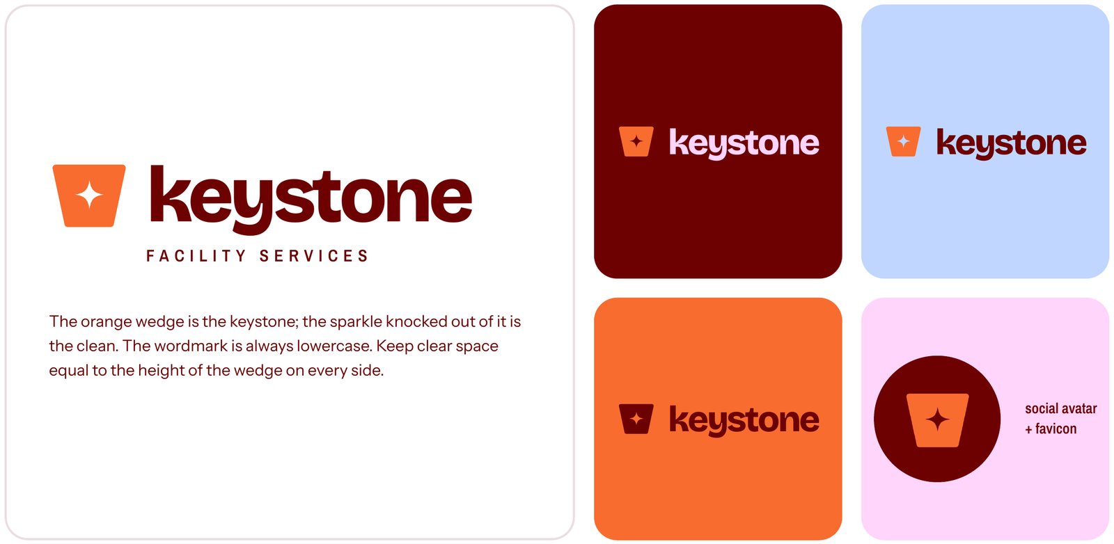
The orange wedge is the keystone. The sparkle knocked out of it is the clean. The wordmark is always lowercase, friendly and solid, with a round avatar version for socials and the favicon.
Flood the frame with one colour and let a single orange thing break it. Oxblood, powder blue and lilac, with signal orange as the punchline. No beige, no navy-and-orange tradie look.
#6D0101#C0D6FF#FFD5FB#F86C2F#FFFFFF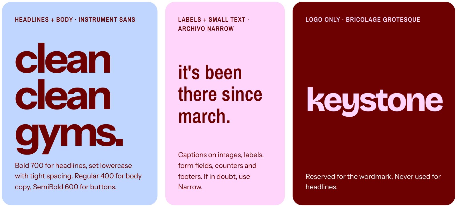
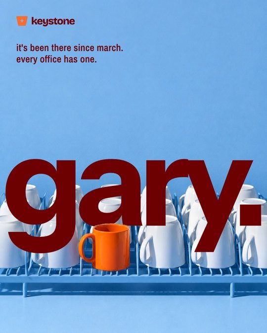
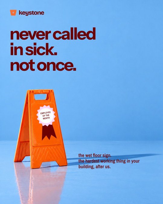
Millennial, self-aware and dry. Every post is a joke people in offices recognise, with something genuinely useful underneath. The expert who doesn’t act like one.
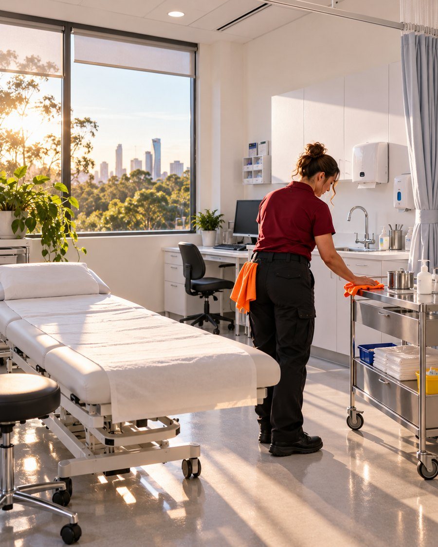
Studio sets for social: flat colour, hard flash and one orange hero object. The crew at work for the website: real Brisbane spaces at sunrise, oxblood polos and orange cloths.


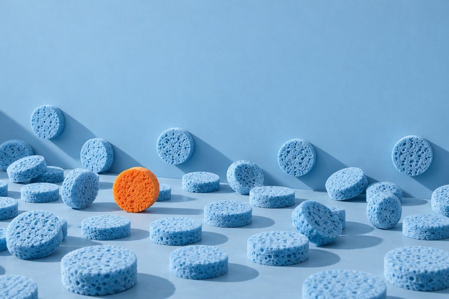
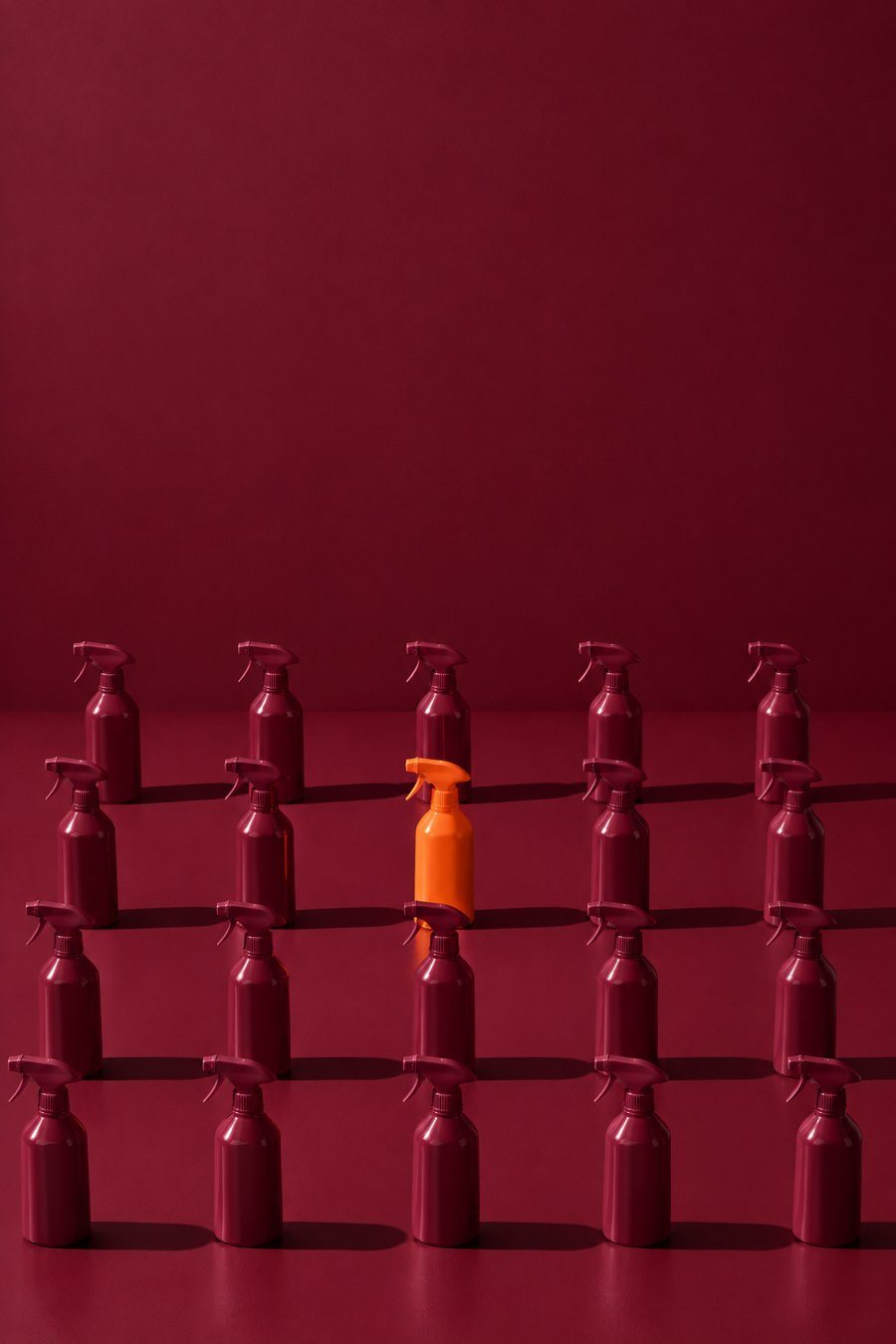
One big idea per image, never the same format twice in a row, and the lesson lives in the caption. The image makes them laugh; the caption invites a walkthrough.
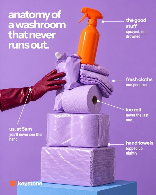
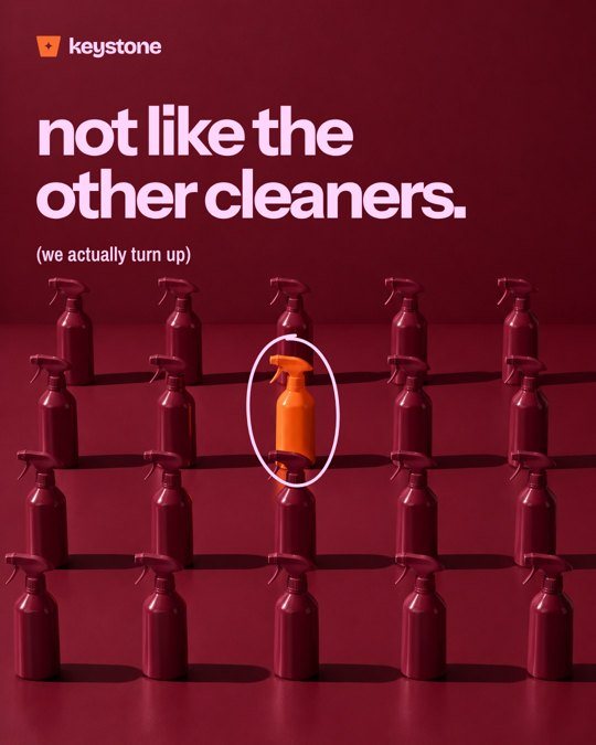
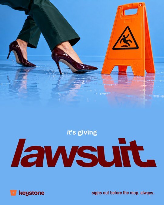
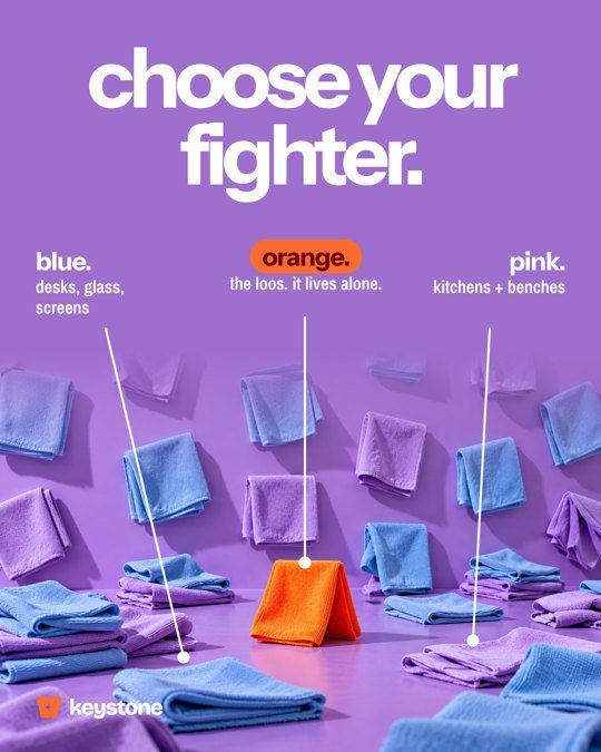
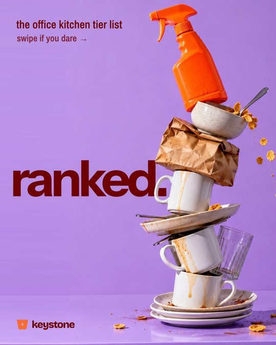
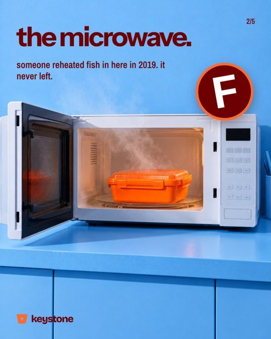
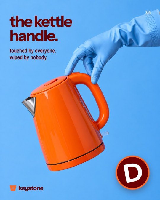
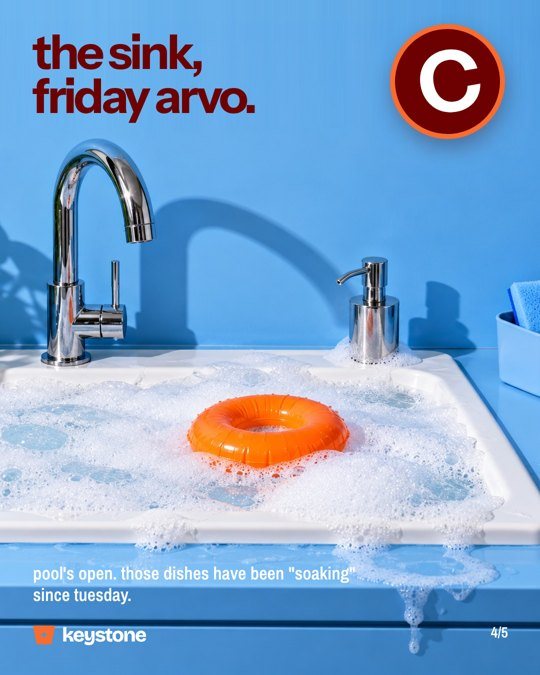
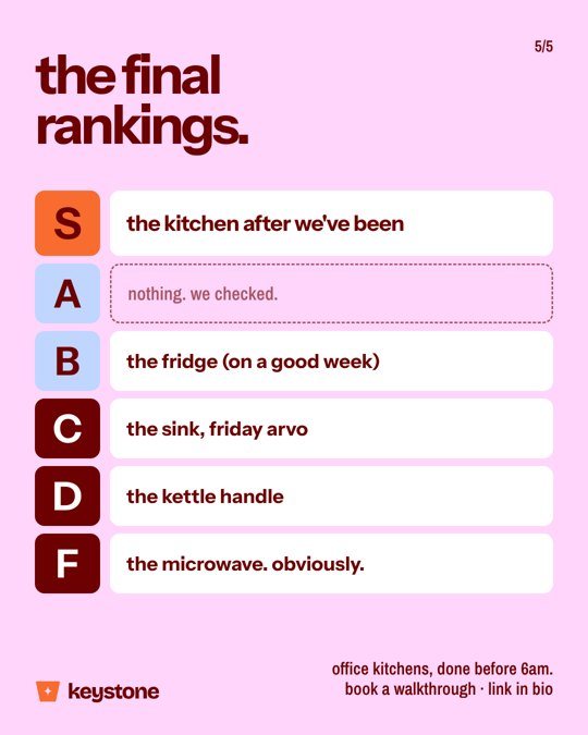
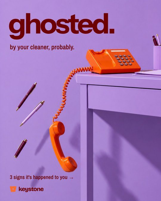
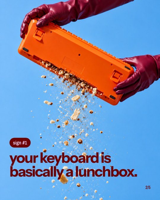
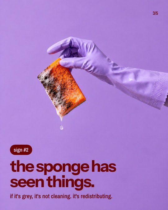
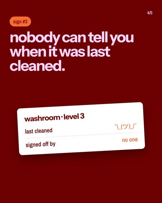
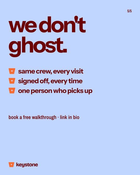
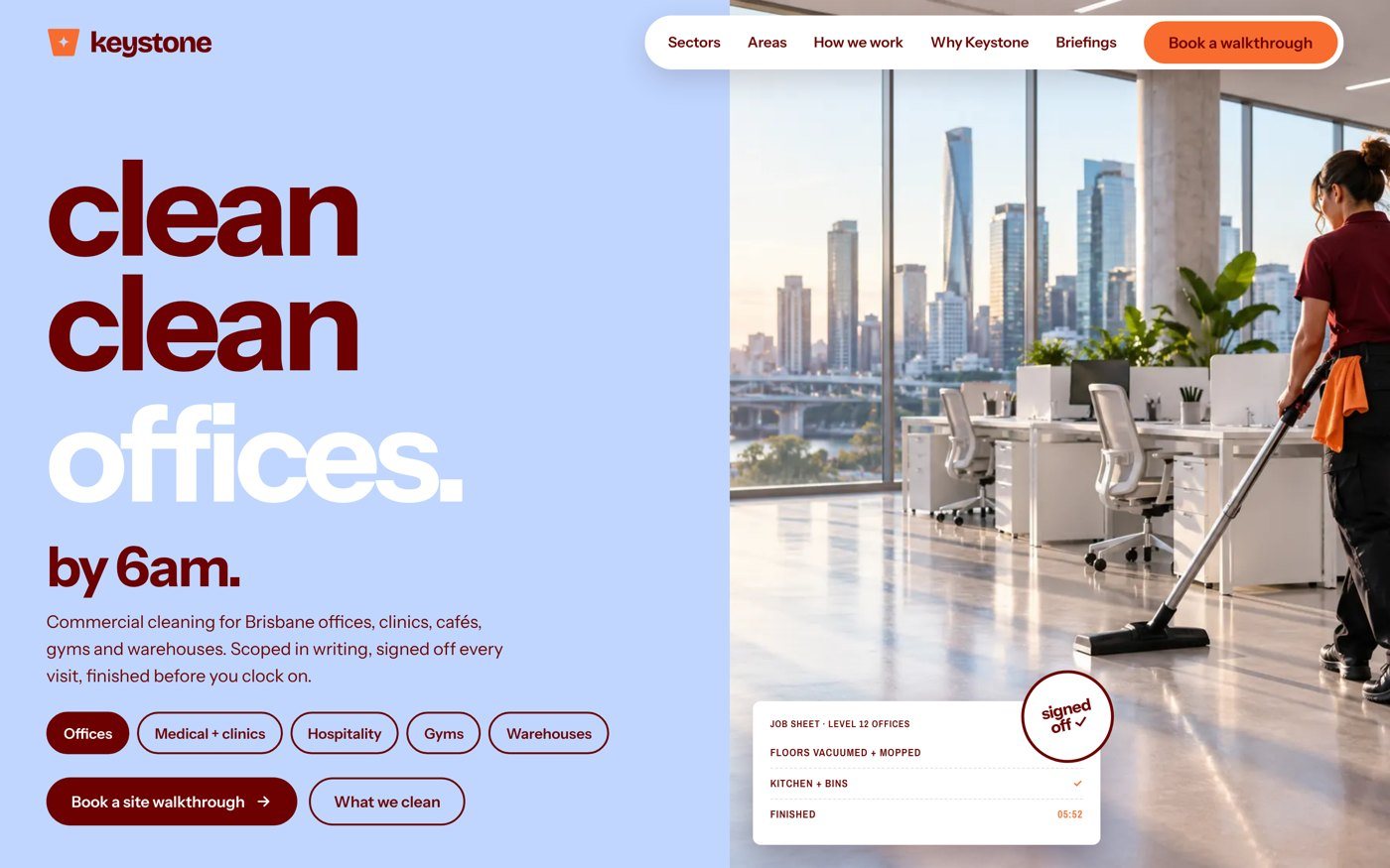
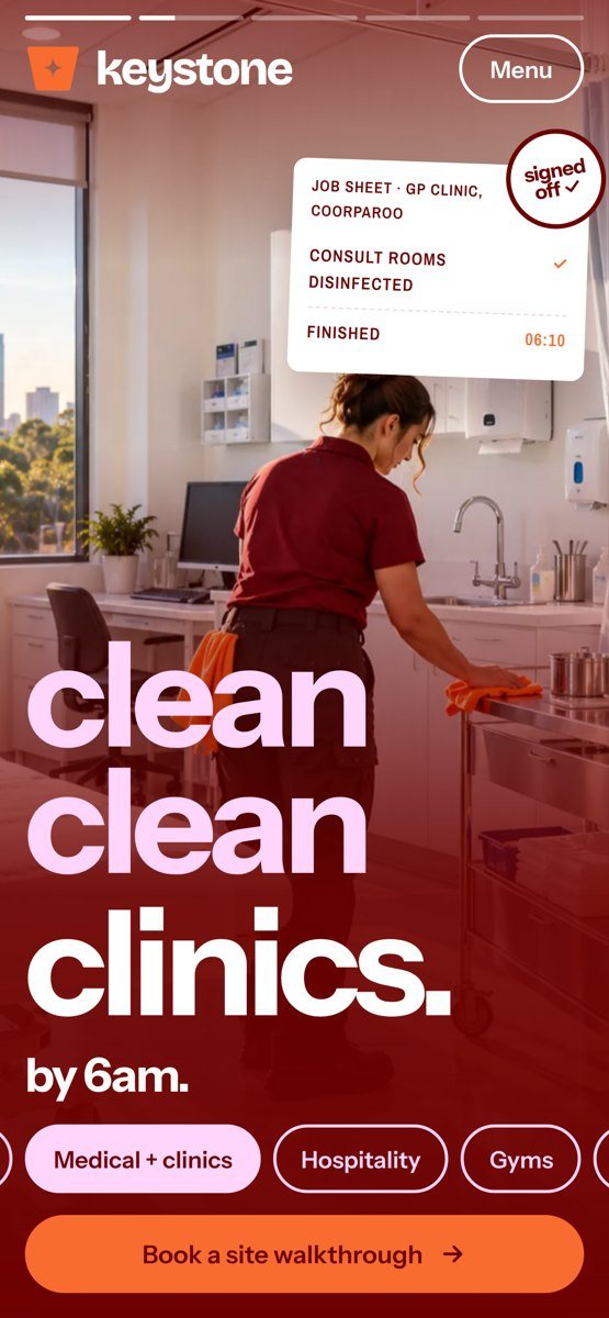
The homepage headline rotates through the sectors Keystone cleans: offices, clinics, cafés, gyms and warehouses. Every sector and every service area gets its own page, and every page leads to one action: book a site walkthrough.
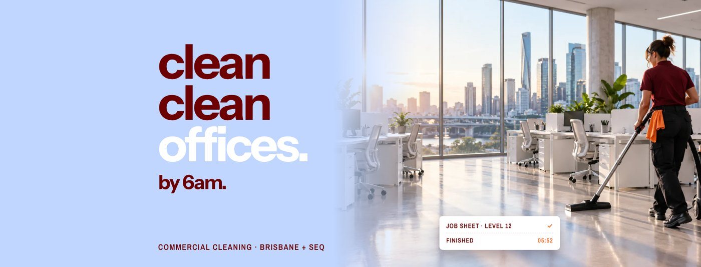
A complete rebrand, from the idea to the posts going out.
Keystone now has a brand that looks like nothing else in commercial cleaning, a voice its audience actually reads, and a website built to turn facility managers into booked walkthroughs.
Ready for a rebrand that people remember? Branding, logo design, social media and website design by Fine Mess are available in Cairns and right across Australia.
Rebrands aren’t scary. Tell me about the business and what’s holding it back.